
Cotswolds Countryhouse: Behind Closed Doors Pt. VIII

Something we always say at Light & Dwell is “it’s all in the details”. Every item/material we source and present is cohesive to one another (down to the last detail). Our designs are intended to be completely holistic and when one thing is taken away, it’s like removing a piece to the puzzle- it simply won’t be complete. We create spaces to feel connected…From the main rooms like kitchen, living, and dining to the unseen spaces like bedrooms, pantries, and laundry rooms, they all carry a harmony and each one feels “wholeheartedly home”. Take a peek and read below to find out more about the nuts + bolts of my home and the motifs that make each space feel connected and cohesive while remaining one of a kind and unique!
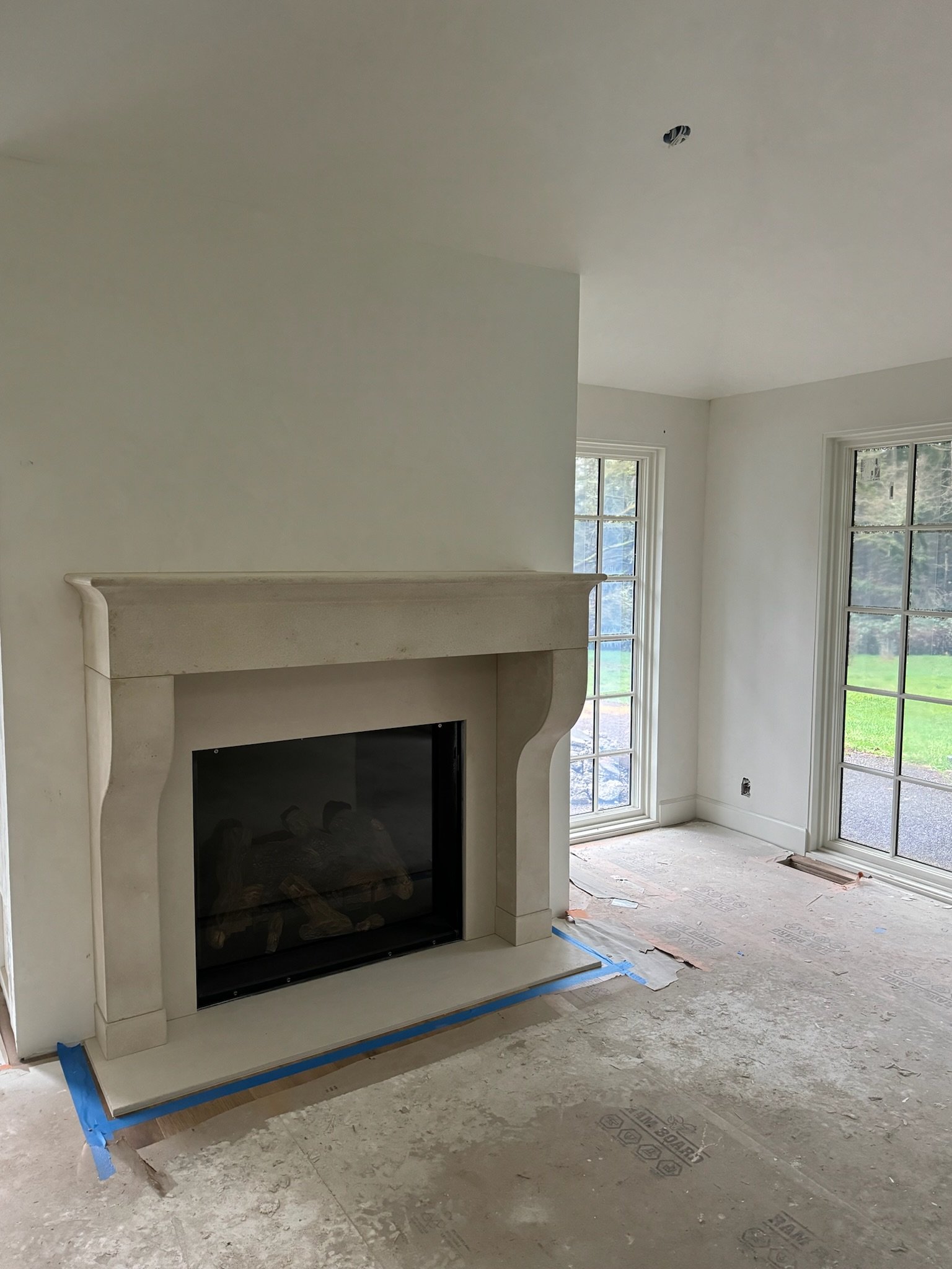
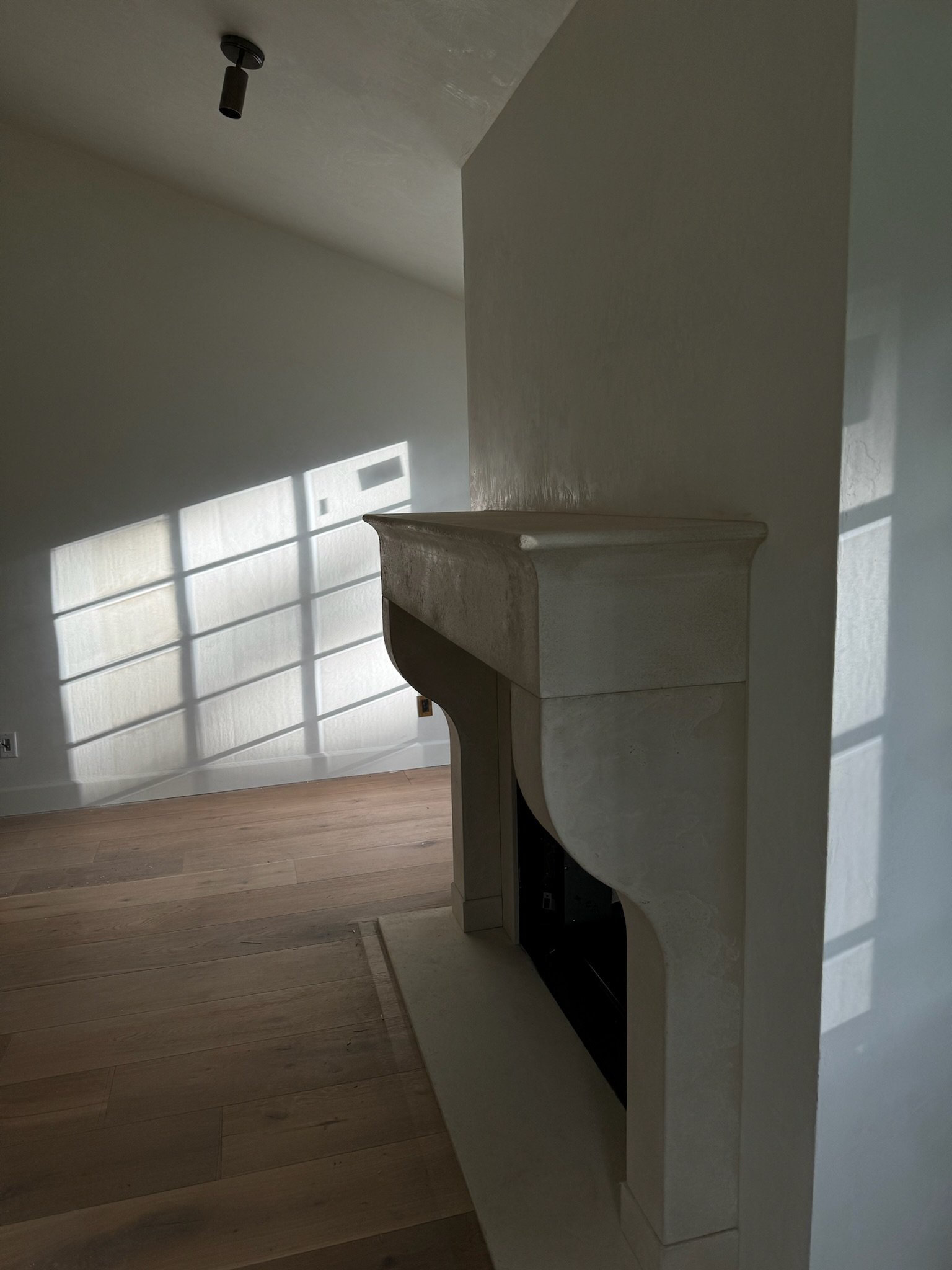
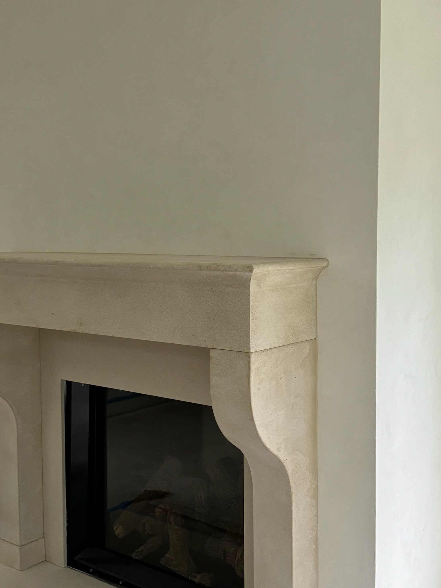
Fireplace
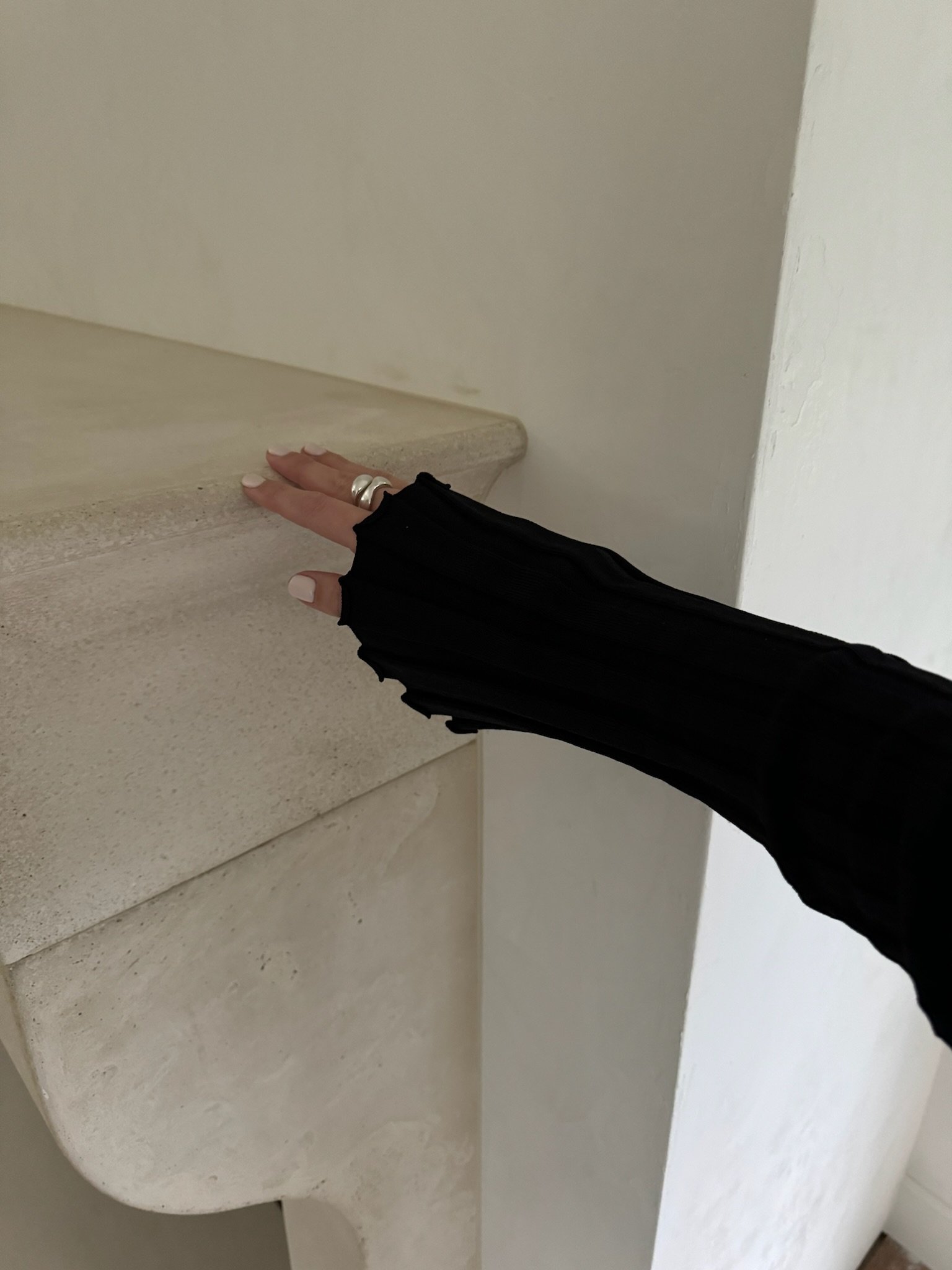
We are feeling the heat with this stunner of a fireplace! I wanted it to be grand and oversized with a large ledge on top of the mantle (for styling treasures of course) and taper downward with a decorative profile. Would you believe me if I told you I tried 15 different samples to get the color just right! I kept referring to the plaster color, lighting finish, and hardwood flooring because it all had to flow, perfectly. It was worth the wait! I love the outcome and think the fireplace and cast gives the room this warmth and impactful presence that references back to the integral design.
plaster
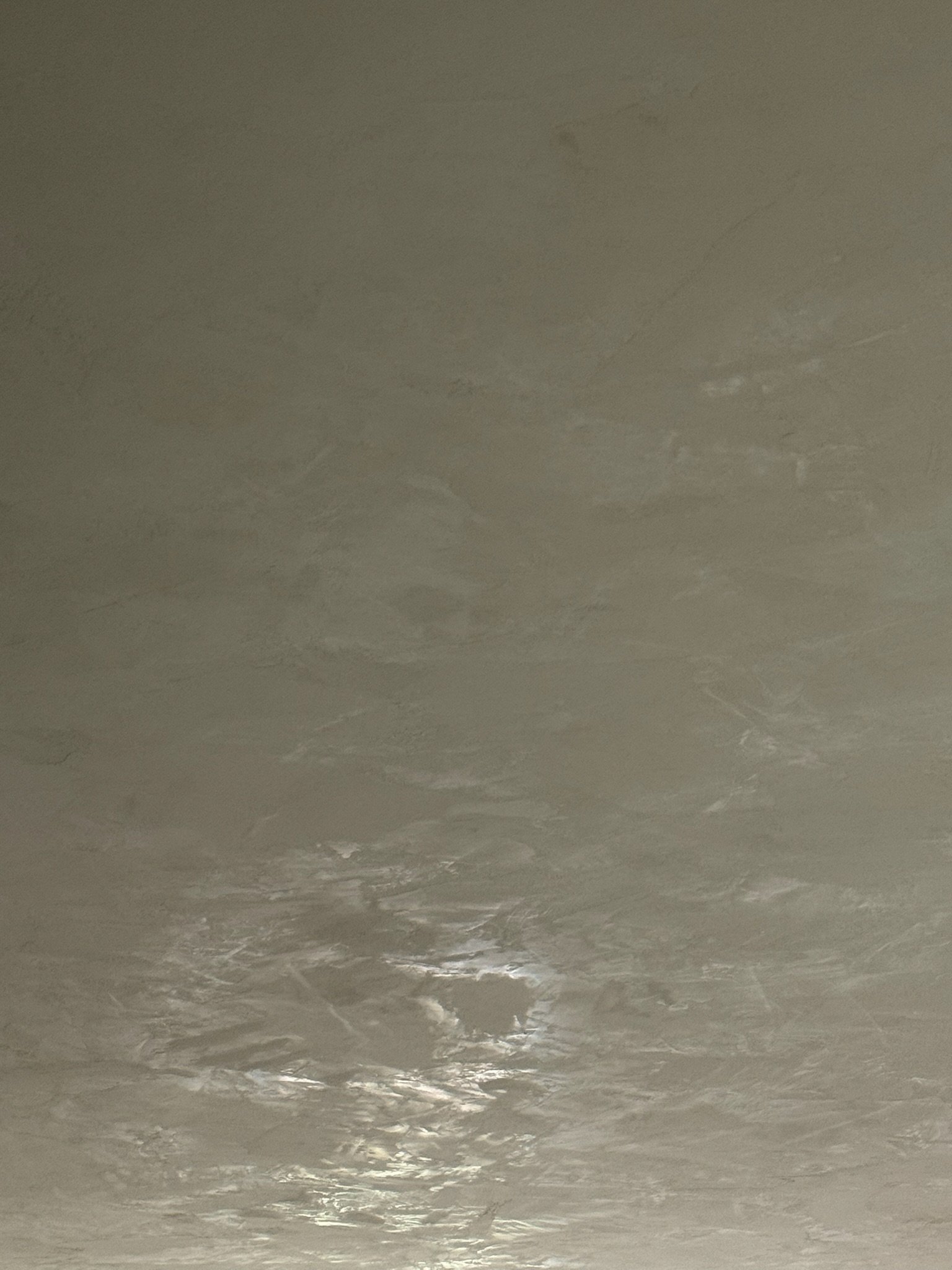
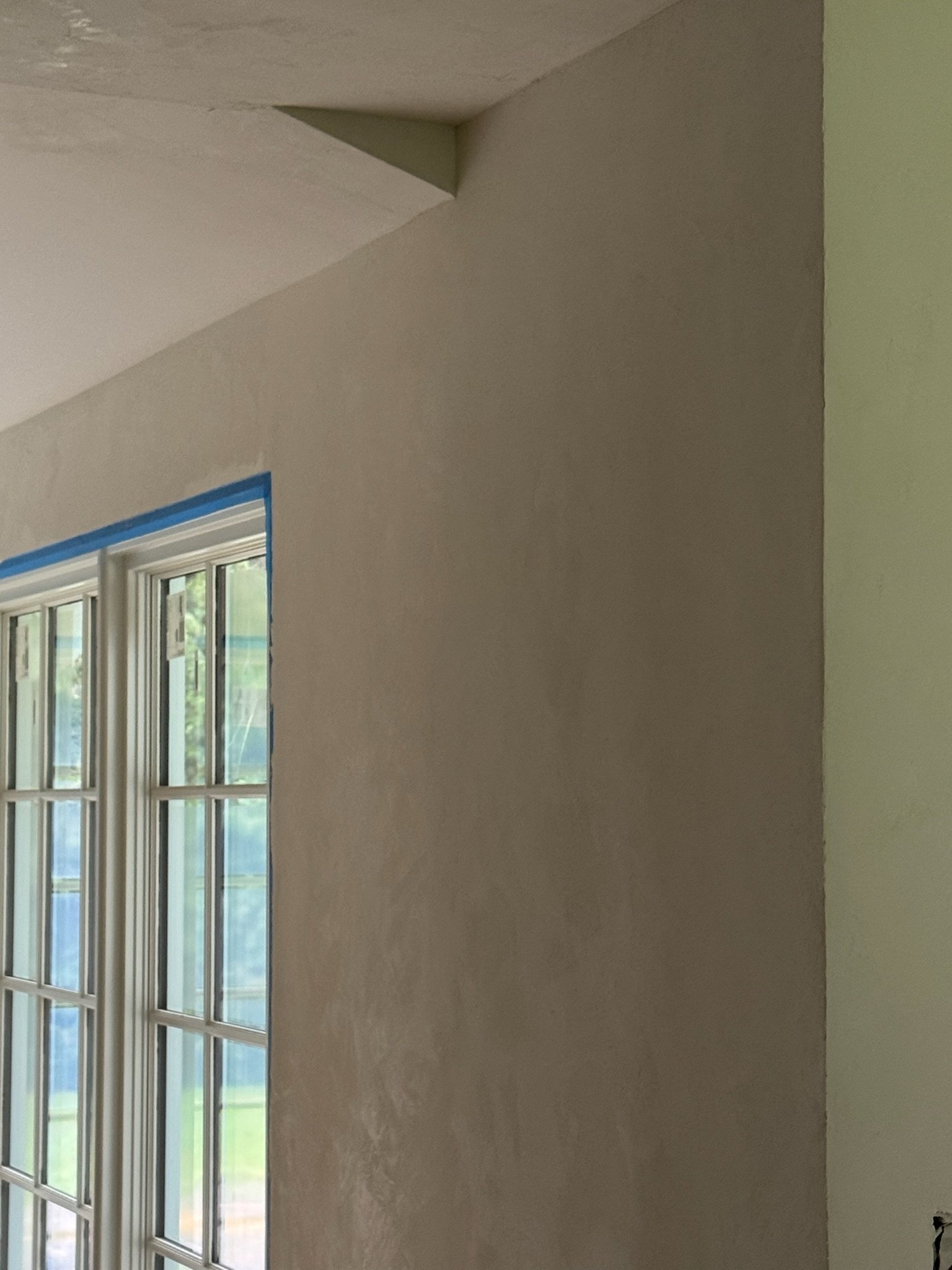
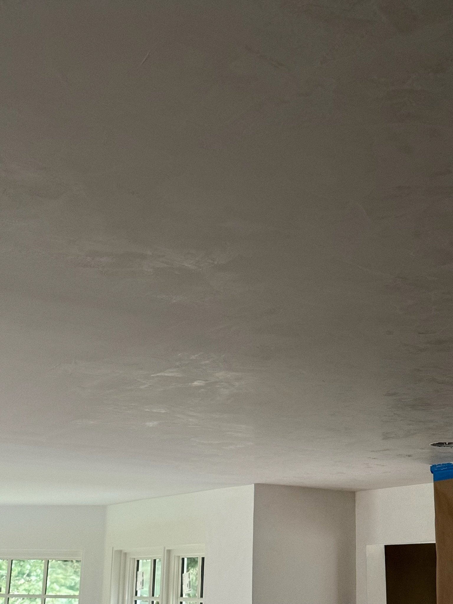
Once you go plaster, you never go back. If I had to be a wallflower, it would be on these Venetian plaster walls. I wanted them to lean warm and created a custom color-way to get the look (Swiss Coffee). This wall condition speaks for itself, but truly provides unparalleled texture, depth, and movement. The walls need less art and decor because of this timeless effect. We use plaster or roman clay in every project and it is a through line throughout all of our six styles because of it’s timeless effect. The quality and intention behind the hand applied treatment is signature to us and therefore had to be in my home. I wouldn’t have it any other way!
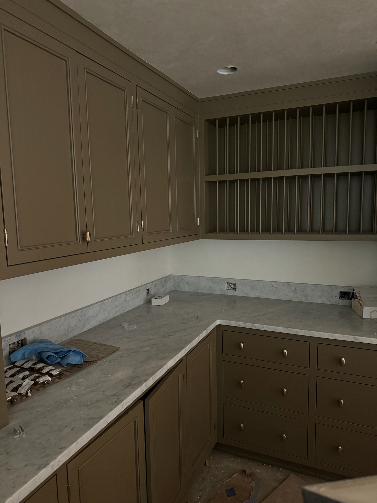
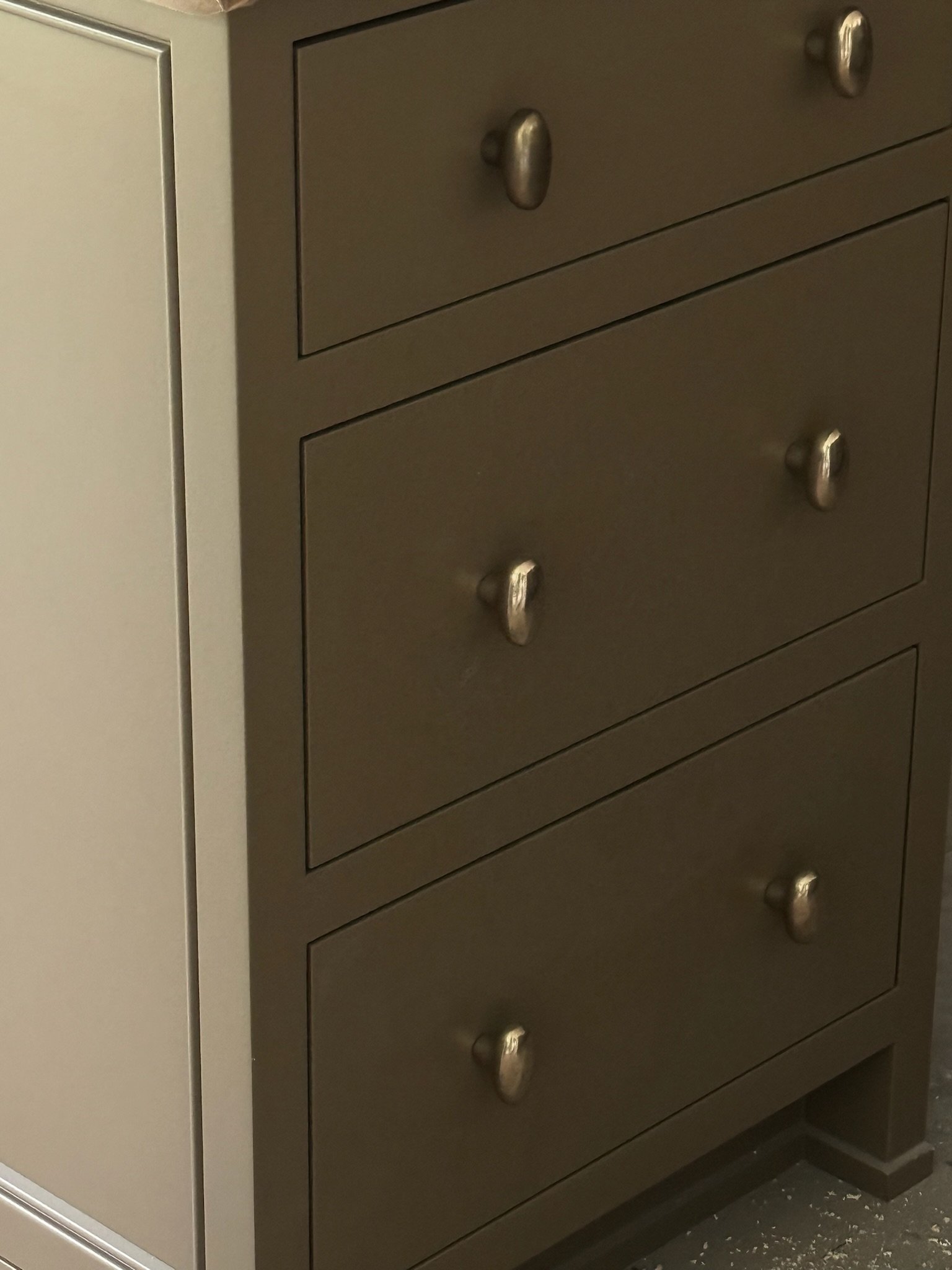
paint colors
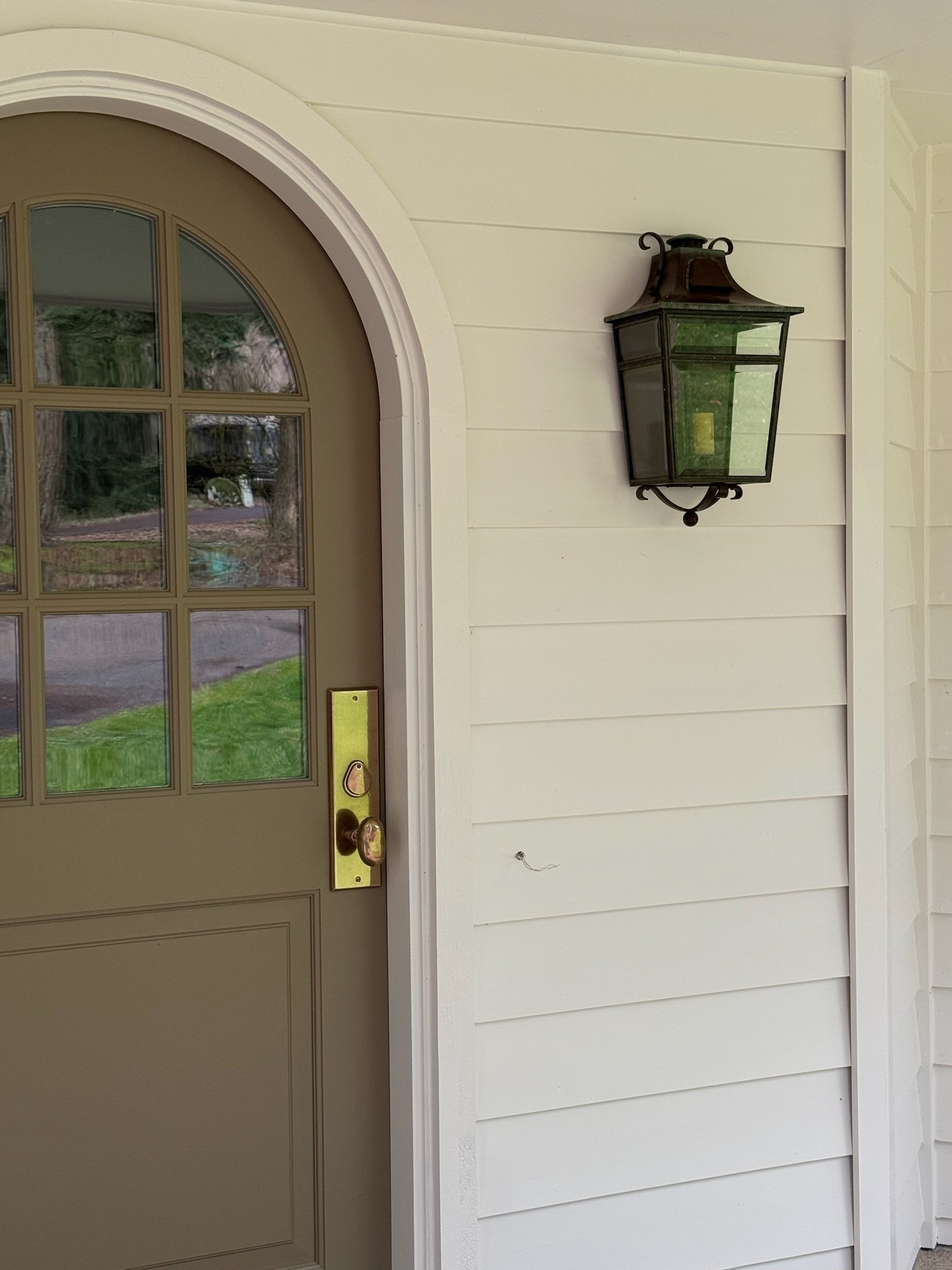
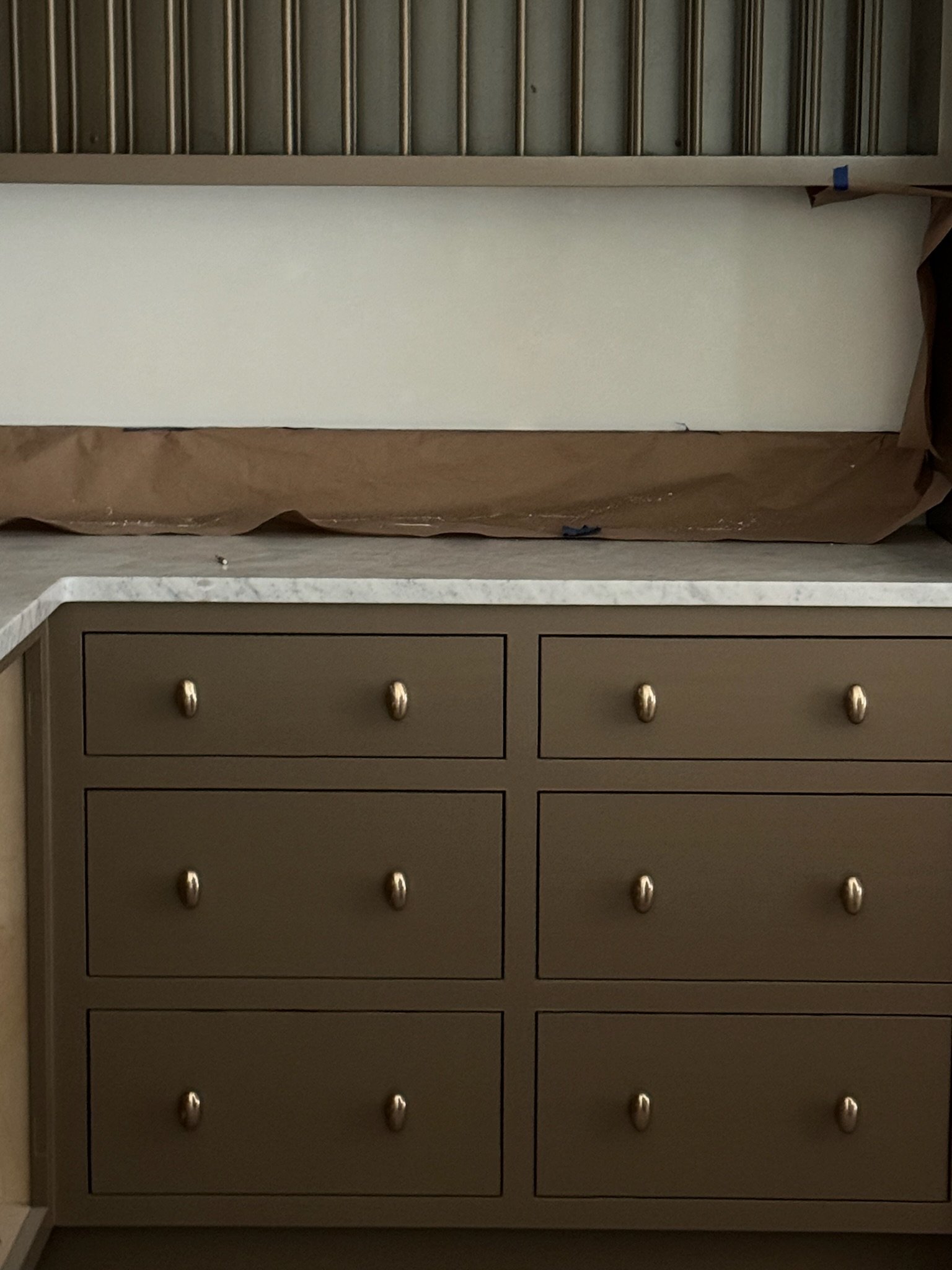
One of our most frequently asked questions for CC is about….paint. We get it, nothing transforms a space quite like a fresh coat of paint and deciding which one is right for you (and committing) can be a daunting process. The color palette I design with each home has to be thoughtfully curated to provide fluidity from space to space. We are always finding color inspiration from the land. There is no better way to connect house and landscape than to find inspiration from it’s surroundings and use nature/history as our North Star. The rich, moody hues I chose for my home are: Front door and kitchen are Broccoli Brown by Farrow & Ball. My office is Wainsct by Farrow & Ball. Karoline’s room is Deep Reddish Brown by Farrow & Ball. MORE TO COME!!!
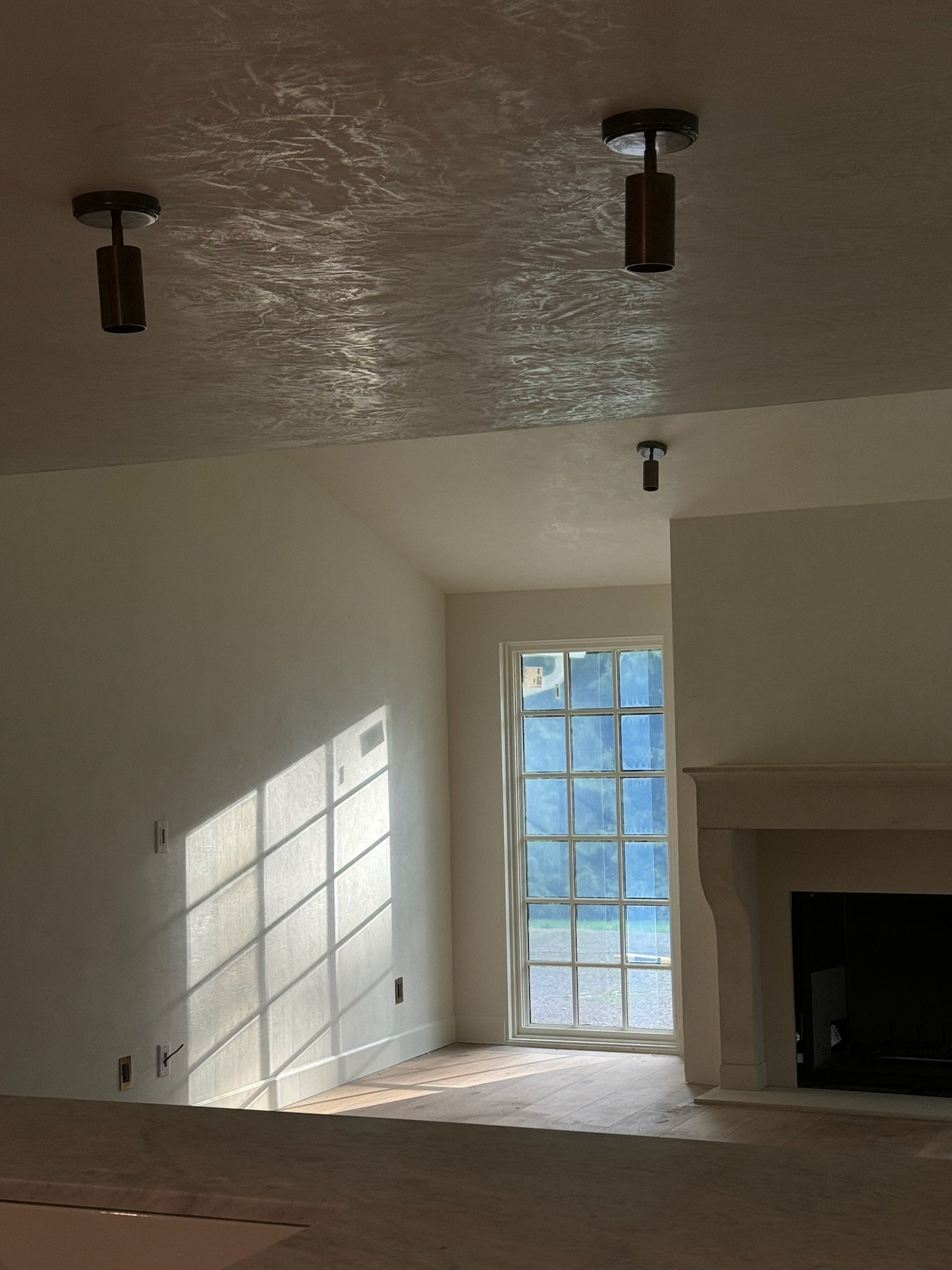
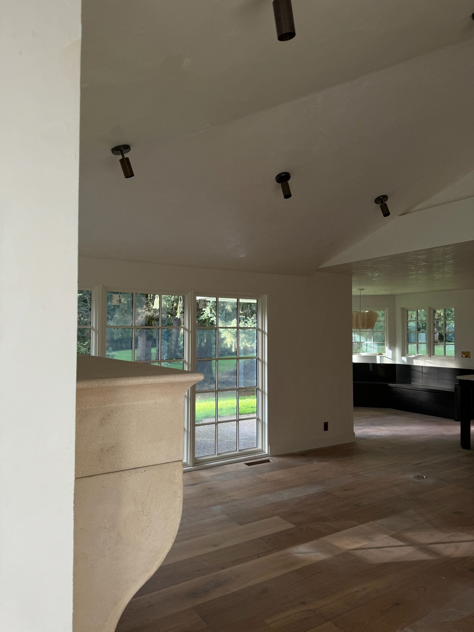
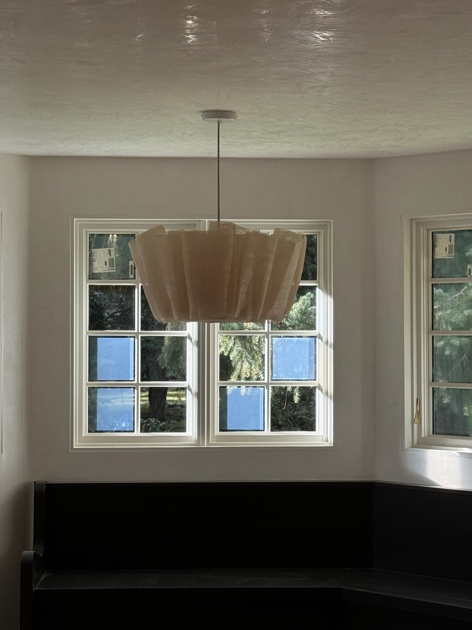
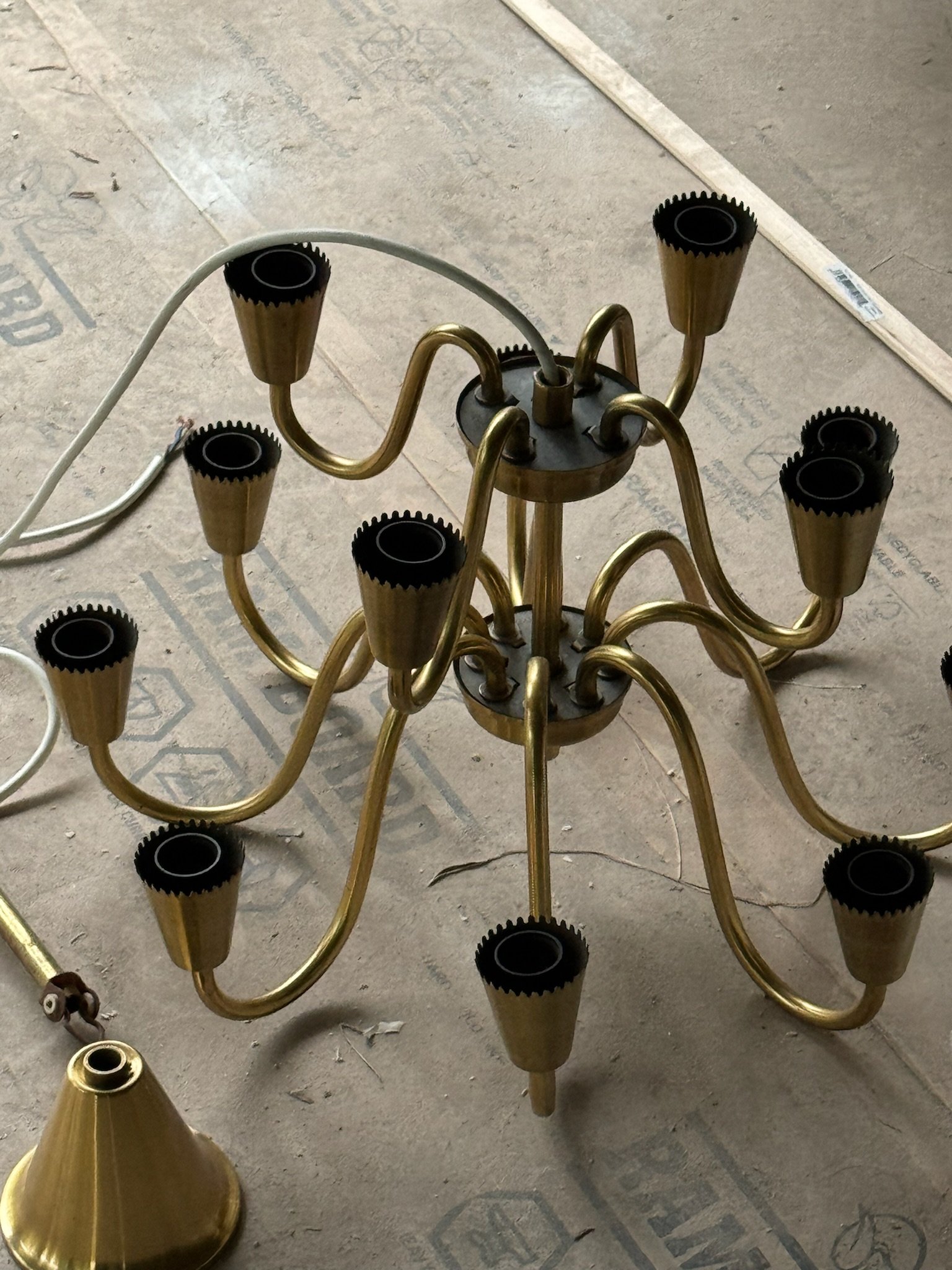
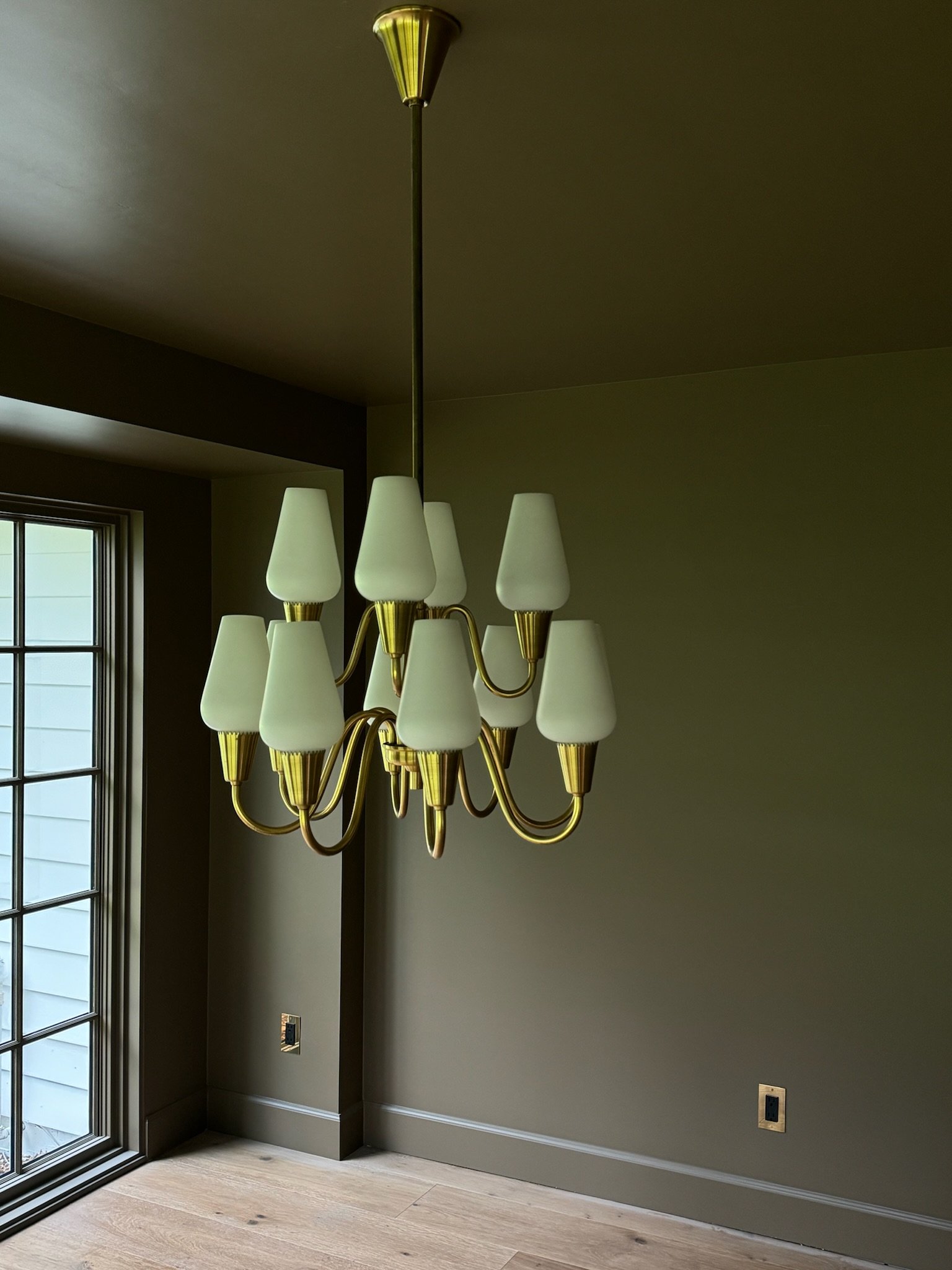
Lighting
Less is always more when it comes to quality lighting. We believe this is one of the most important areas to invest/splurge on in a project. One of my very first purchases for this home was the Danish chandelier hung in my dining room (3rd & 4th picture). It has the most beautiful patina and adds the right amount of character. The cylindrical lights in the kitchen (1st picture) are from Mullan Lighting and elevate the space with its perfect juxtaposition of form and function. Our breakfast nook is adorned with a European Pinch Pendant (2nd picture) and is very romantic, made out of high quality banana leaf fibers draped to perfection. Did anyone notice my beautiful exterior lantern above? Its Ralph Lauren…need I say more?! Every light selected reflected feels like a work of art and speaks to the room and home as a whole.
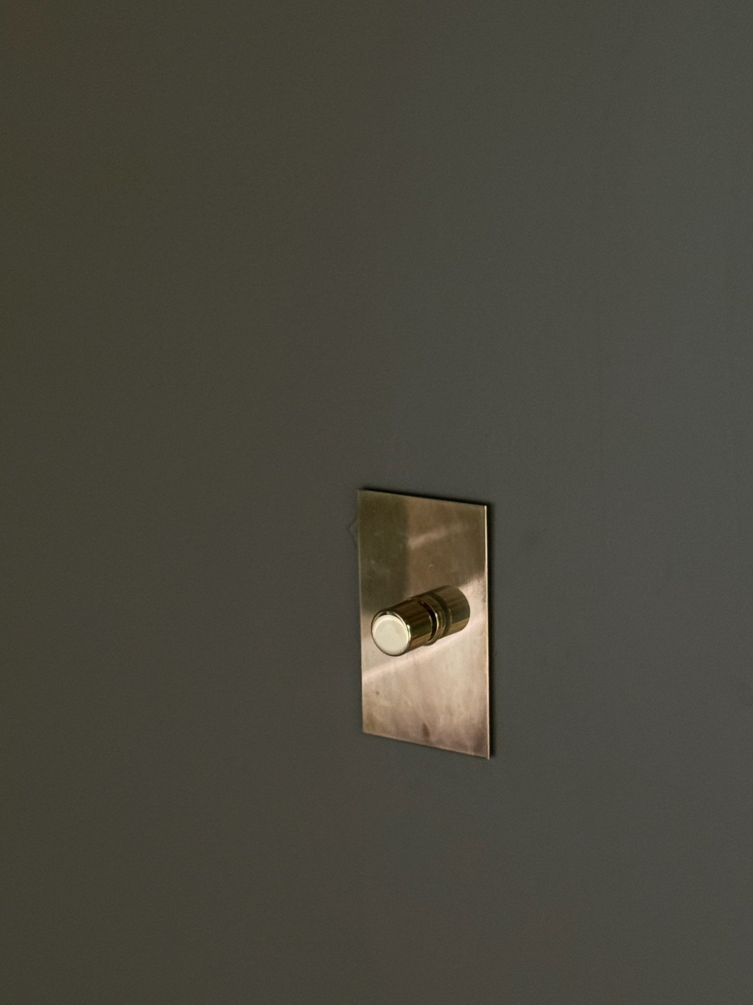
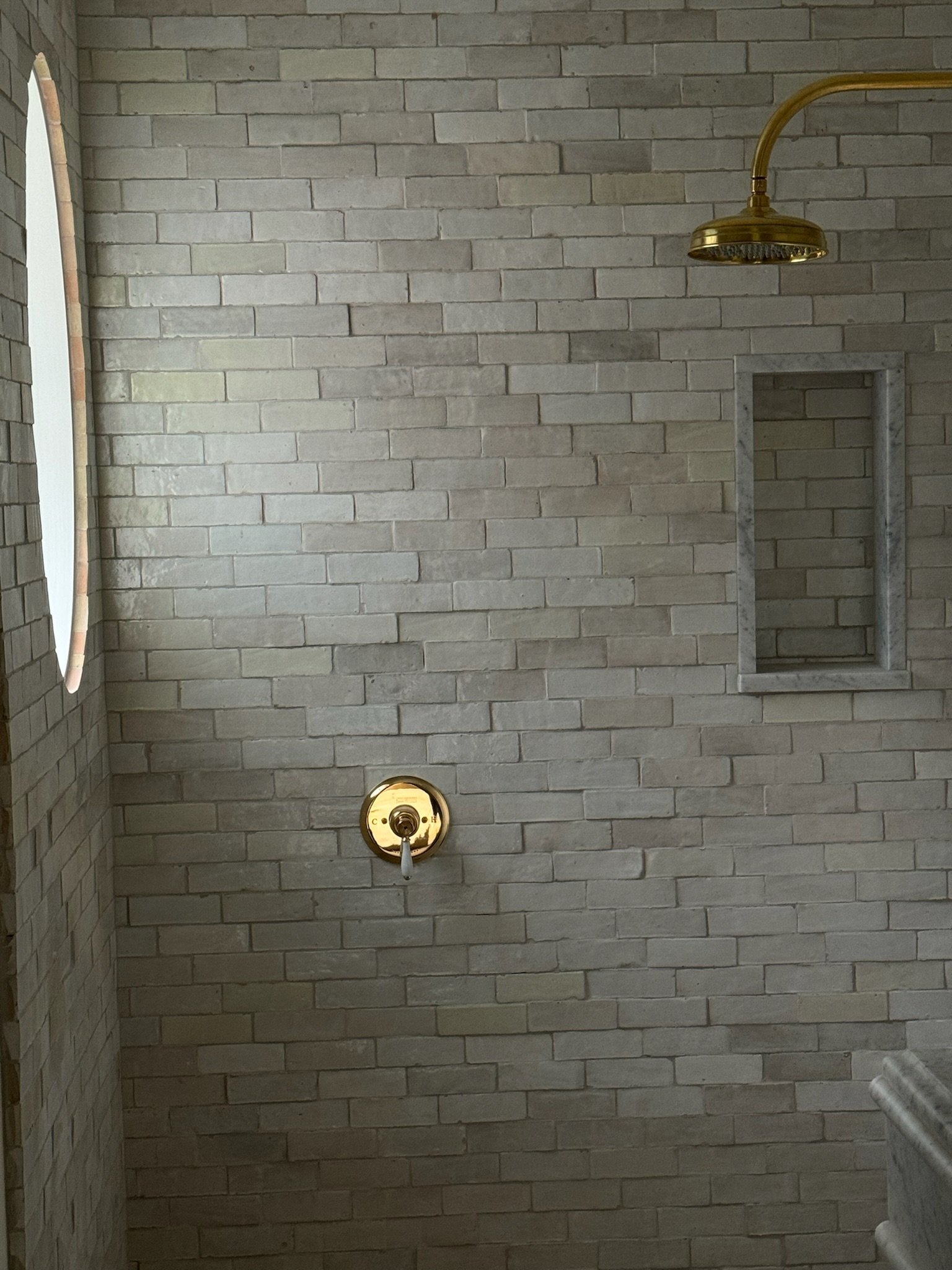
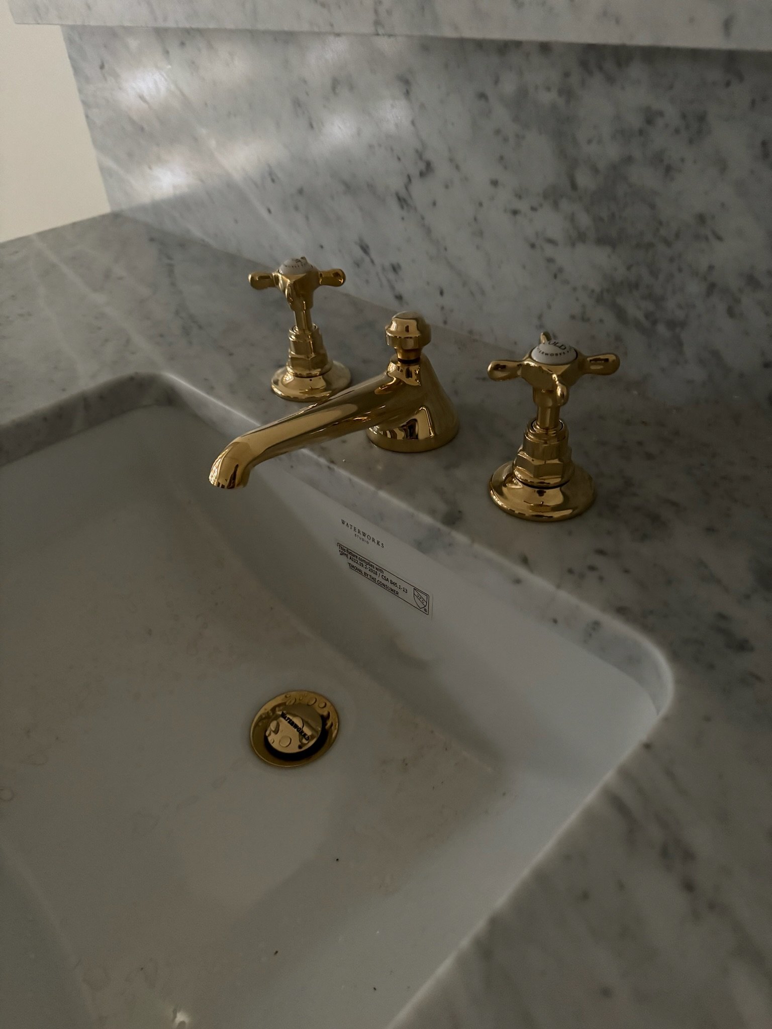
hard finishes
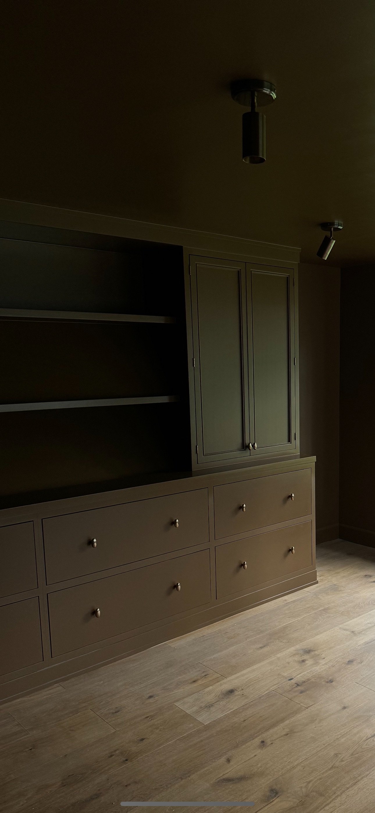
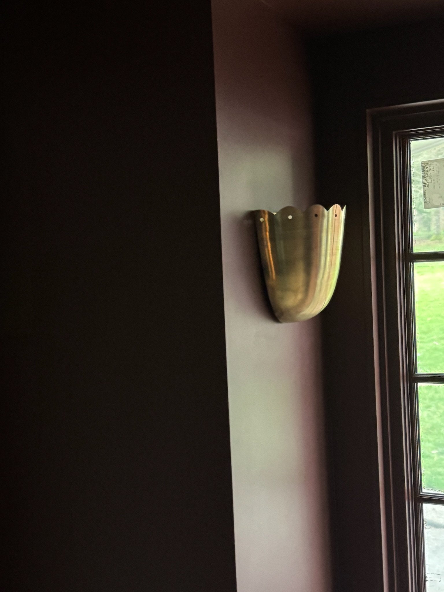
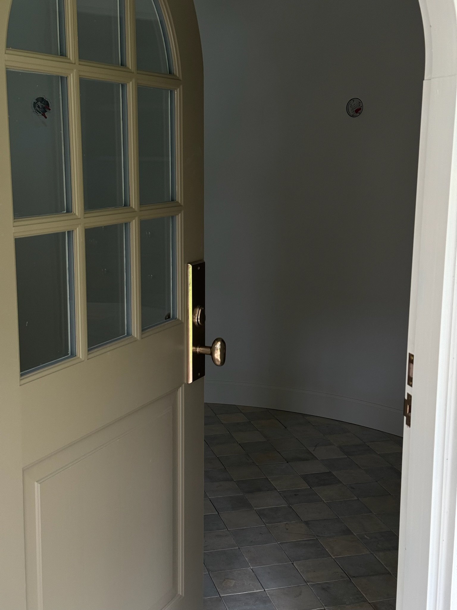
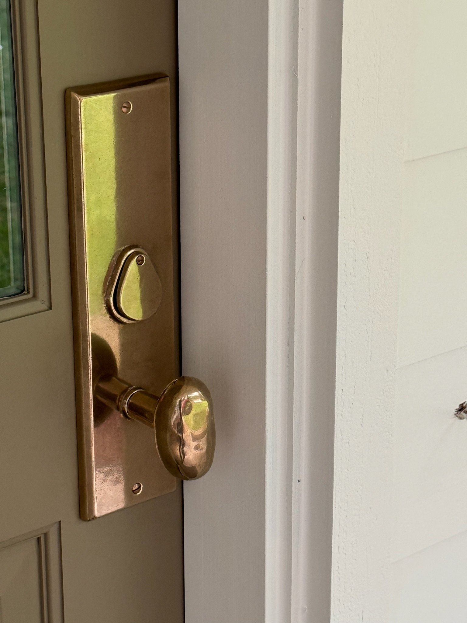
Sometimes the smallest details have the biggest impact. From the Rocky Mountain potato front door and kitchen cabinetry potato knobs to the Waterworks plumbing features, we exclusively used Chown Hardware for all of the hard finishes. The wall switch plates are a decorative splurge that I can’t do a project without. They elevate and adorn every wall with an artful flare and the tiny gesture just makes a huge statement! Again, it is all about intentional details and quality over quantity.


SHOP MY LOOKS
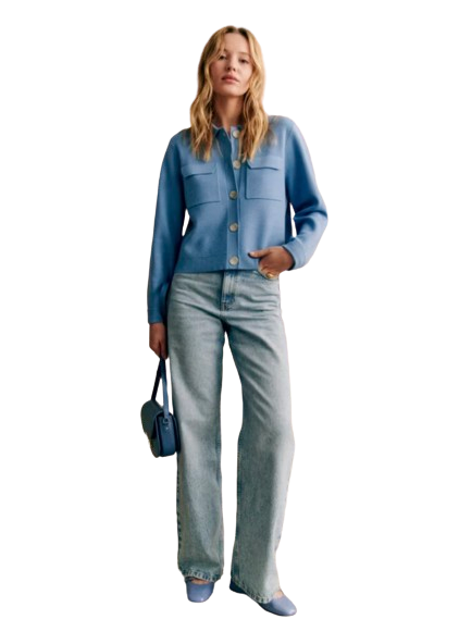
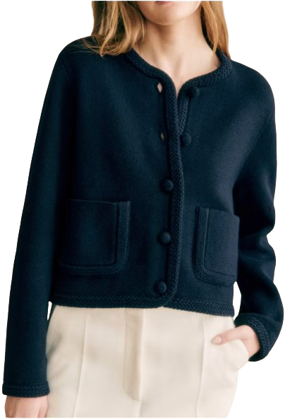
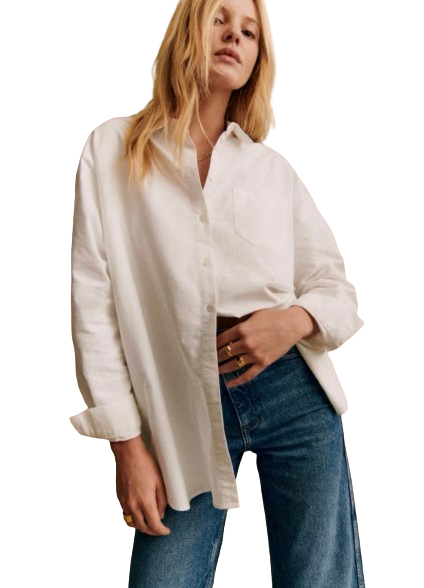
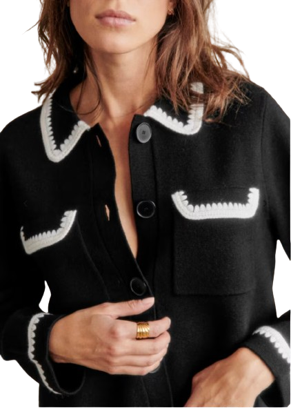
Collected some special pieces from Sezane this month. Jewel tones are big right now and I am very into shades of blue for Spring.. Sharing my picks below!

& if you’re playing catch up or need a refresher you can check out our previous Cotswolds updates here! Believe it or not, we’re only a few weeks away from moving in!
xx. Molly